French Rose

 This is a card I CASED last year. (I cannot remember who from)

I feel it has such a sophisticated look about it…maybe it is just because it has used French Script as the background?

I didn’t have the punch that was used for the “thank you” background, so I made my own using the Scallop circle and an oval punch. Then I sponged the edges to give a deeper feel.

The rose is coloured by the “Re-inker” technique or “Floating watercolour” technique. It certainly is one of my favourite techniques especially for adding a variety of colours to larger outlined images. The photo doesn’t do it justice for how it actually looks.

Butterfly wishes

This was such a quick and easy card to do for my niece’s birthday.

I have just received the butterfly punch and was quite eager to play with it. It certainly helps when you also purchase a matching stamp set such as Butterfly Prints.

I previously had some other company’s embossing folder and used that to layer the butterfly’s on. Add to that a base card in Elegant Eggplant and all is done.

Alright I hear you say, I also added a layer on the inside so I could stamp some flowers and write all the best wishes etc…

Just what a gorgeous little 11-year-old likes.

Extreme Expresso Birthday

 I had another 40th Birthday card to make this week for a male friend.

Has everyone seen the Extreme Elements stamp set? I really like it for male cards and you can use it for all age groups. I have also teamed it up with the Grunge Rock stamp set as well. Grunge Rock is only available during the current Summer Mini promotion until 31st March.

The background paper is Very Vanilla and I have stamped with various stamps from both sets in Cake Crumb, River Rock and Marina Mist ink. I have cut out the Guitar image and highlighted it even further by using dimensionals. You can still gets the brads, but I am afraid the ribbon and Star Brad have retired (just utilizing the last of my stock). You could certainly use a matching Early Expresso Ribbon and then substitute the star for an Antique Brad, a Jumbo Brad or even a different Star Brad out of the Hodgepodge Hardware kit.

I suppose you could even highlight it was a 40th card by adding “40” from the big shot dies, or if it was a younger male even adding some Chocolate or Aqua glitter on the guitar. I thought about both of these ideas, but ran out of time in my preparation. Hope you like it.

MultiColoured Dragonfly’s

 This was for a niece’s birthday. I was playing with some Glossy white card stock and embossing.

I have a couple of different techniques on this card. Firstly I stamped and embossed the dragonfly (from Bugs and Kisses). Then I used the versamark and stamped some other insects on the background ( you will have to look very closely in the photo to see them). Then it was time to use the brayer over the top in Pink pirouette. The background insect creates a type of watermark in the background.

I like using Markers to colour, so I have used several to add a multicoloured effect within the wings of the dragonfly.

As you can see I liked the result so much I made one in male oriented colours, with a different Happy Birthday stamp layered on Designer Label and Curly Label punches.

Sponging with an alternate colour gives the impression of another layer. Comes in handy at times.

If you like it let me know.

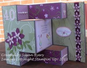
My sister turns 40

Linda turns 40 My sister turned 40 last year. It has taken me 3 months to show her card, so my new years resolution is definitely going to be “To Blog More Frequently”.

It took me a little while to get this card how I liked it, and I have to admit that when my husband and I boarded the plan to travel interstate for her party, I left it behind. Not my best move.

There are lots going on in terms of elements and style. Big Shot Alphabet and Leaves Dies. Multiple punches (Big Flower, Little Flower, Oval, Scalloped Oval and Scalloped Edge), paper piecing and cut outs, watercolouring, embossing, embellishments (such as brads, pearls, ribbon, felt flowers), glitter, DSP and all put together on a trishutter card.

Linda close up

You can probably find a few other different techniques if you look closely.

Even though the DSP has retired, you can get the same pattern but in a different colour. The new one is called Sunny Garden.

I have used stamp images from multiple sets including Cottage Garden, Occasional Quotes, and Cheers to You.

Hope you like it as much as I do.

Glittery Presents

I just found a couple of cards that I made for some birthdays earlier in the year. The first one is for my DD who turned 11 (as if you couldn’t tell). I purchased the big shot when it came out in the mini catalogue this year, and I also purchased the alphabet die. It also has numbers and a few shapes as well. I had been hanging out for some nice sized number stamps for a while now, but when this came along, well I thought it was a whole lot better.

 The layout I have cased and used a number of times with cards I have made, but with this one I changed it from a landscape to a portrait design. This layout can so easily be used with all sorts of colours or stamp patterns, depending on what you want to say. Plus I was eager to use the new colour Rich Razzleberry. Plus my daughter just loves anything with glitter. One of the comments she made on her birthday was, “…all my cards have glitter on them”.

This next card I made for my nephew. I know it is bright and glittery, but that is his personality.

Now you may be looking at this card and thinking “haven’t I seen this one before?”. Well in fact, yes you have. I CASED myself. Having to make a card for a thirteen year old boy(especially when I had limited Male orientated stamps) I was a bit stumped for ideas, so i took a card I made and I think I actually improved on it.

So… who is clever enough to have remembered which other card looks like this?

Baby Shower

This is the first card I have made using a new stamp set from the 2010-2011 IB&C. You will have to excuse the focus of the camera work, but I just had to take a picture before rushing out the door to a baby shower. My goodness me, it has been long time  since I have been to a baby shower. When I first arrived I was given two pegs, if you said “Baby” then you lost a peg to whoever heard you. I think I was the first one out.

Anyway, back to the card at hand. This new set is called Baby Bundle, and how apt that it had a verse about baby showers.

I must admit, that I left making the card until the last minute and under pressure, just couldn’t think of how to make the card. Thank goodness for the internet, because I went surfing and found a card with a very similar layout, and went Yes! I like that card. So what you see is my final creation.

Origami Fathers Day

I made these two cards for my children to give to their father on Fathers Day.

Both feature “Origami”. I know what you are thinking… if you are anything like me, you haven’t done Origami since you were at school.

But these are both great for male inspired cards. I found the instructions through other demonstrators and knew as soon as I saw them ages ago that this is what I wanted to use them for.

Both have used retiring colours, card stock and DSP, but that’s fine, you get the point.

My 11 year old daughter was so inspired from this card, she made a 30cm “tie” from DSP and cardstock, thread ribbon thru the top, so dad could slip it over his head and she also wrote on the back of it. I am always so amazed at the imagination of children. They often have very different ideas from us, but theirs is no less important.

Chalkboard

This was my first successful attempt at the Chalkboard technique.

I say successful, because I had tried it before using Versamark and chalk, but really couldn’t get it to look right.

That was until another lovely demonstrator over at ESAD showed me how.

ESAD is short for Extra Special Australasian Demonstrators. They are a bunch of helpful talented ladies that I am proud to be a member of.

Anyway, back to the chalkboard technique. I feel you get a much better result once you use the White craft ink and then colour with the chalk. I still have to improve on not smudging, but I feel this turned out pretty OK.

Too easy 96

I participated in this weeks Clean and Simple challenge.

As soon as I saw it and started reading some of the suggestions the girls had used, I knew I had half done this challenge already.

The images I have stamped onto the Very Vanilla card stock, are almost 2 years old. This is one of the first A4 sheets I stamped. Now normally when you do this you use it for making “Own DSP” or “One Sheet Wonder”.

I kind of never got around to using it.

With changes in the air as far as Colours are concerned at Stampin’ Up! I thought I might as well put this to good use.

What I like about making your own DSP, is that it always has 3-4 colours in it.

This is perfect when making multiple cards as you can easily change the colour of the base card and you have easily transfigured the feel of the card.

Add to that a different sentiment and the change is almost complete.

I say almost, because when I was making these cards, I had some leftover pieces of card that I just couldn’t resist throwing together.

The Vanilla card in the centre is what I came up with.

As per normal, my children like to comment on my cards (there is nothing like honesty), and they liked the vanilla card more.

It must be because they are used to seeing much more elaborate designs from me, but that certainly doesn’t mean that there is anything wrong with the other cards I have created.